


Published: | Category: Guide
...What Eye-Tracking Research Teaches Us About Accessible Web Design
A webpage can be technically accessible and still be difficult to understand. Navigation can exist but be hard to find. Links can work but fail to look clickable. Important information can be present but buried beneath competing visual elements.
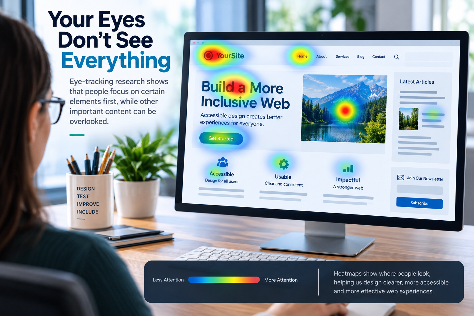
Eye-tracking research gives us another way to examine these problems. By recording where people look, how long they focus on particular areas, and how their eyes move through an interface, researchers can study how visual design affects attention, reading, navigation, and cognitive effort.
Eye tracking does not tell us whether a website is accessible by itself, and it should never replace testing with disabled users or established accessibility standards. But recent research provides some fascinating clues about how people actually experience the interfaces we build.
What Does Eye Tracking Actually Measure?
Eye-tracking systems generally record where a person's gaze lands while they interact with content. Researchers can then analyze several measurements, including:
- Fixations: moments when the eyes remain focused on a particular area.
- Fixation duration: how long a person looks at that area.
- Saccades: rapid movements between fixation points.
- Gaze paths: the sequence in which different areas are viewed.
- Time to first fixation: how long it takes someone to notice an element.
- Areas of interest: predefined parts of an interface that researchers want to compare.
These measurements can help researchers investigate attention and interaction patterns. They may also provide evidence about cognitive effort, particularly when combined with other measurements or usability observations.
But an important distinction needs to be made: looking at something does not necessarily mean understanding it. Likewise, failing to look at an element does not automatically explain why it was ignored.
Accessibility Can Change How We Visually Process a Page
Recent research has investigated whether accessibility-oriented design changes the way people visually interact with web content.
A study published in PLOS ONE examined visual attention while participants read news websites containing different levels of support for low-vision and cognitive accessibility. Researchers combined eye-tracking data with heart-rate variability measurements to investigate different forms of visual attention and cognitive engagement.
One particularly interesting aspect of the research is that the participants did not have disabilities. This helps illustrate a broader principle of accessible design: improvements intended to reduce barriers for people with disabilities can also influence how other users process information.
Accessibility therefore isn't only about whether information technically exists or can be reached. The way information is presented can affect how efficiently people visually locate and process it.

The First Few Seconds: Where Does Attention Go?
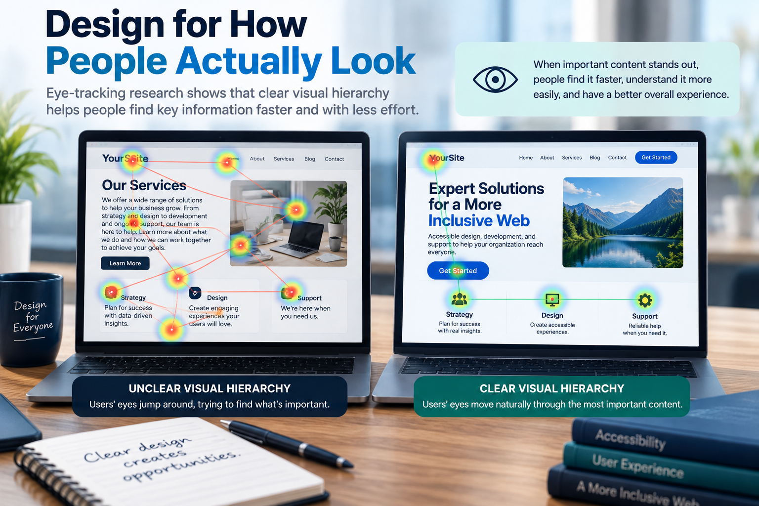
When someone opens a webpage, they rarely process every element equally. Headings, images, navigation, calls to action, advertisements, color, spacing, and other visual elements compete for attention.
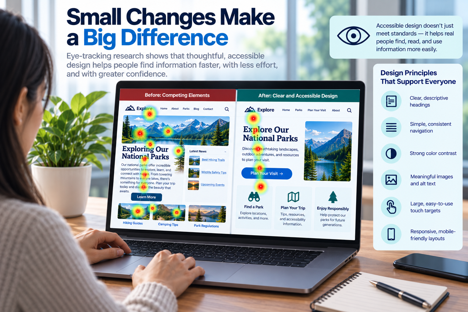
Eye-tracking research allows designers to see this competition directly. Heatmaps and gaze plots can reveal which areas receive immediate attention, which are discovered later, and which may be overlooked entirely.
This reinforces the importance of a clear visual hierarchy. Important content should not have to compete with numerous elements of similar visual weight. Headings should be visually distinguishable, related information should be grouped, and decorative content should not overwhelm functional content.
Good hierarchy doesn't force everyone to follow the same path. Instead, it makes the structure of the page easier to recognize.
Navigation Can Exist and Still Be Difficult to Find
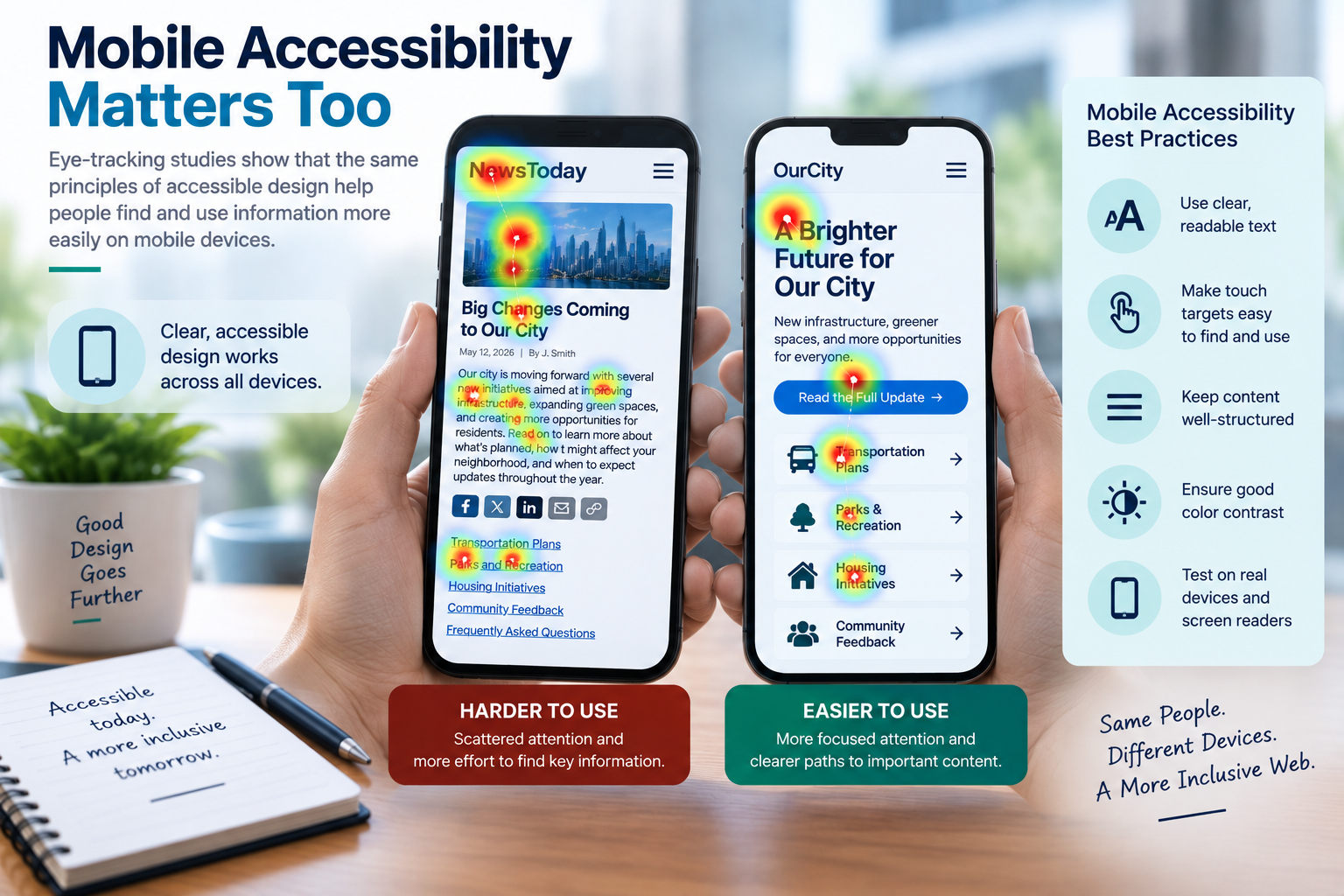
Semantic HTML provides essential structure for assistive technologies, but semantics alone cannot guarantee visual discoverability.
Research involving a digital healthcare interface combined eye tracking with questionnaires and interviews to study how participants navigated the system. Researchers reported substantial differences in how easily participants located navigation elements across mobile and web interfaces.
The study also found differences related to factors such as age and language proficiency, demonstrating why designers should be cautious about assuming that every user will interpret an interface in the same way.
This creates an important distinction:
Technical accessibility and visual discoverability are related, but they are not the same thing.
A perfectly structured <nav> element may provide excellent
landmarks for a screen reader while still being visually difficult for another
user to locate.
Spotting What's Clickable
Links and interactive controls are another area where visual attention matters. A link may be completely functional while providing weak visual clues that it can be activated.
Recent eye-tracking research comparing different website presentations has examined measurements such as fixation duration, visit duration, and fixation count. Differences in these measurements suggest that visual presentation can meaningfully affect how users encounter interactive content.
For accessible design, this supports a familiar but important principle: interactive elements should look interactive.
Color can help distinguish links, but color should not be the only visual cue when doing so would make the link difficult to recognize. Underlines, consistent styling, predictable placement, and clear focus indicators can all help communicate interactivity.
Descriptive link text provides another layer of clarity. A visually recognizable link tells someone that an action is available; meaningful link text helps explain what that action will do.
When There's Too Much to Look At
More visual information does not necessarily create a more informative experience.
A 2023 eye-tracking experiment examining web banners found differences between simpler and more visually complex designs. Simpler banners received longer and more frequent fixations, while highly complex designs were associated with indicators of greater cognitive effort and were perceived as less appealing.
Although this research focused on banners, the underlying question applies broadly to interface design.
Imagine a page containing several calls to action, multiple accent colors, animations, promotional cards, large photographs, notification banners, and competing headings. Every individual element might be perfectly understandable on its own, yet the combination can make it harder to determine what deserves attention.
Whitespace, grouping, restrained use of emphasis, and a clear content hierarchy can reduce this competition.
Images Are Powerful Attention Magnets
Eye-tracking studies repeatedly demonstrate the ability of visual content to attract attention. That can be extremely useful when an image reinforces the surrounding information.
It can also become a problem when decorative imagery competes with the actual purpose of the page.
Designers should therefore ask more than whether an image looks attractive. Consider what role the image plays in the visual hierarchy.
- Does the image reinforce nearby content?
- Does it help explain something that would otherwise be difficult to understand?
- Does it unintentionally pull attention away from a more important action?
- Is important information embedded inside the image?
- Does the image have appropriate alternative text when it conveys meaningful information?
The goal isn't to avoid imagery. It is to use imagery deliberately.
Reading Is More Complicated Than Moving Left to Right
Eye tracking is particularly useful for studying reading because researchers can observe individual fixations, regressions, skipped words, and other patterns that occur while someone processes text.
Recent studies have continued investigating how text presentation influences reading behavior and information processing, including research comparing conventional, difficult-to-read, and Easy-to-Read text formats.
These findings reinforce an important accessibility principle: readability is influenced by more than font size alone.
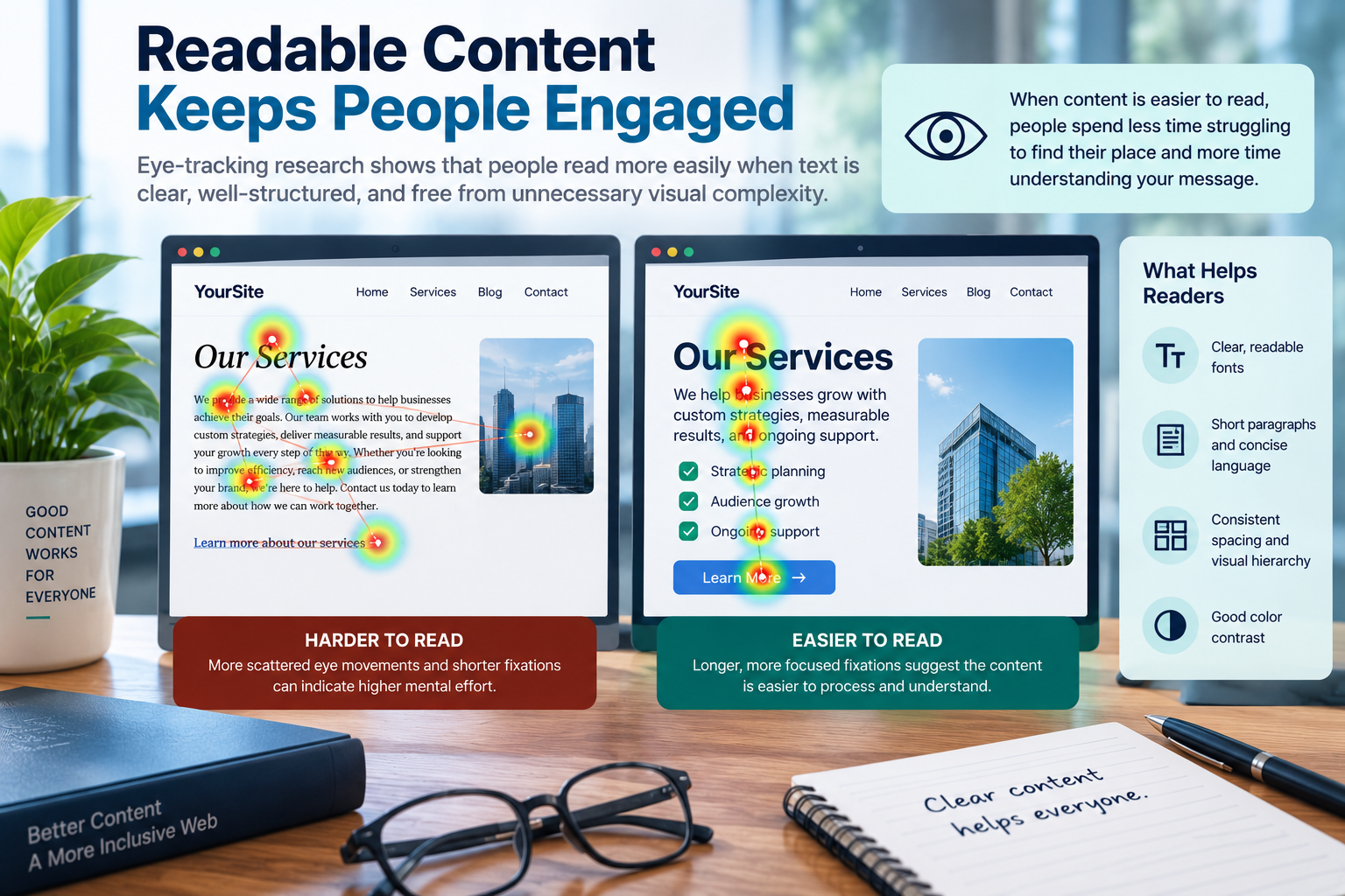
Line length, spacing, vocabulary, sentence structure, typography, contrast, headings, paragraph length, and surrounding distractions can all affect the reading experience.
This is one reason accessibility guidance should not be reduced to a checklist of individual CSS properties. The experience results from the interaction of many design decisions.
Dyslexia and Eye-Tracking Research
Dyslexia has become a substantial area of eye-tracking research. Recent systematic reviews have examined studies involving reading fluency, word recognition, visual attention, information searching, reading materials, detection, and intervention.
Researchers can observe differences in reading behavior through measurements such as fixation duration, fixation count, regressions, and gaze patterns. These measurements provide valuable research data, but they should not be interpreted as evidence that one design treatment will work universally for everyone with dyslexia.
This is especially important when discussing supposedly “dyslexia-friendly” fonts or layouts. Reading difficulties are complex, individual experiences vary, and the research does not support treating a single typography choice as a universal solution.
Flexible interfaces can often provide a better approach. Allowing users to adjust text size, spacing, contrast, or other presentation characteristics can accommodate preferences that a single fixed design cannot.
Different People May Look at the Same Page Differently
One of the most useful lessons from eye-tracking research is also one of the simplest: there is no universal gaze pattern.
Age, language proficiency, reading ability, familiarity with an interface, disability, device type, screen size, and the task someone is trying to accomplish can all influence visual behavior.
This makes popular claims about universal reading patterns worth treating with caution. Concepts such as F-shaped scanning patterns can be useful descriptions of behavior observed under particular conditions, but they should not become rigid templates for every webpage and every user.
Accessible design works best when it provides strong structure without requiring every visitor to perceive or navigate the interface in exactly the same way.
What Eye Tracking Cannot Tell Us
Eye-tracking visualizations can look remarkably convincing. A colorful heatmap appears to provide a direct window into what someone is thinking.
It doesn't.
A fixation indicates that someone's gaze was directed toward an area. It does not automatically establish that the person understood the information, preferred it, remembered it, or even consciously processed it.
Eye-tracking results are also influenced by study design, participant characteristics, equipment, tasks, calibration, sample size, and the metrics researchers choose to analyze.
For accessibility work, there is another major limitation: eye tracking primarily tells us about visual interaction. Many accessibility barriers cannot be detected by observing gaze.
Eye tracking therefore cannot replace:
- Testing with disabled users
- Screen-reader testing
- Keyboard-only testing
- Automated accessibility testing
- Manual WCAG evaluation
- Usability testing and participant interviews
It is another piece of evidence, not a complete accessibility test.
What Does This Mean for Your Website?
Recent eye-tracking research doesn't provide a magical formula for designing the perfect webpage. What it does provide is additional evidence for several principles that already sit at the heart of accessible and usable design.
- Create a clear visual hierarchy. Help users distinguish primary content from secondary and decorative information.
- Make navigation visually discoverable. Semantic structure is essential, but users also need to recognize where navigation is located.
- Make interactive elements recognizable. Links, buttons, and controls should provide clear visual cues about their purpose and interactivity.
- Reduce unnecessary visual competition. Too many emphasized elements can make none of them feel particularly important.
- Use images intentionally. Visual content can attract attention quickly, so make sure that attention supports rather than distracts from the user's task.
- Design readable content, not just readable fonts. Typography matters, but so do language, spacing, hierarchy, paragraph structure, line length, and surrounding distractions.
- Expect individual differences. Different users may scan, read, and navigate the same interface differently.
- Test with people. Analytics, automated tools, eye tracking, and accessibility scanners can identify useful patterns, but none can completely explain the human experience of using a website.
Final Takeaway: Accessibility Is About More Than What Is on the Page
Accessibility standards give designers and developers essential requirements for creating inclusive interfaces. Eye-tracking research adds another perspective by showing how people visually encounter those interfaces.
It reminds us that putting something on a webpage does not guarantee that people will find it. Making something clickable does not guarantee that people will recognize it as interactive. And presenting information does not guarantee that it will be easy to process.
Accessible design works best when semantic structure, visual hierarchy, readability, discoverability, and user testing reinforce one another.
Ultimately, the most interesting lesson from eye-tracking research may not be where people look.
It is how much thoughtful design can influence what they are able to find, understand, and accomplish once they get there.
References and Further Reading
- PLOS ONE — Research examining web accessibility features, visual attention, and cognitive engagement
- Universal Access in the Information Society — Eye tracking for evaluating accessible and usable interactive systems
- Procedia Computer Science — Eye-tracking measurements and web interface design
- Applied Sciences — Eye-tracking research examining visual complexity in web banners
- International Journal of Medical Informatics — Eye tracking and usability evaluation of digital healthcare interfaces
- Education Sciences — Systematic review of eye tracking and dyslexia research
- Disability and Rehabilitation: Assistive Technology — Review of eye tracking applications involving dyslexia
- Recent eye-tracking research comparing difficult-to-read, control, and Easy-to-Read text formats