

The Adventures of the Calamnet Wizard – Panel 8

Intro!
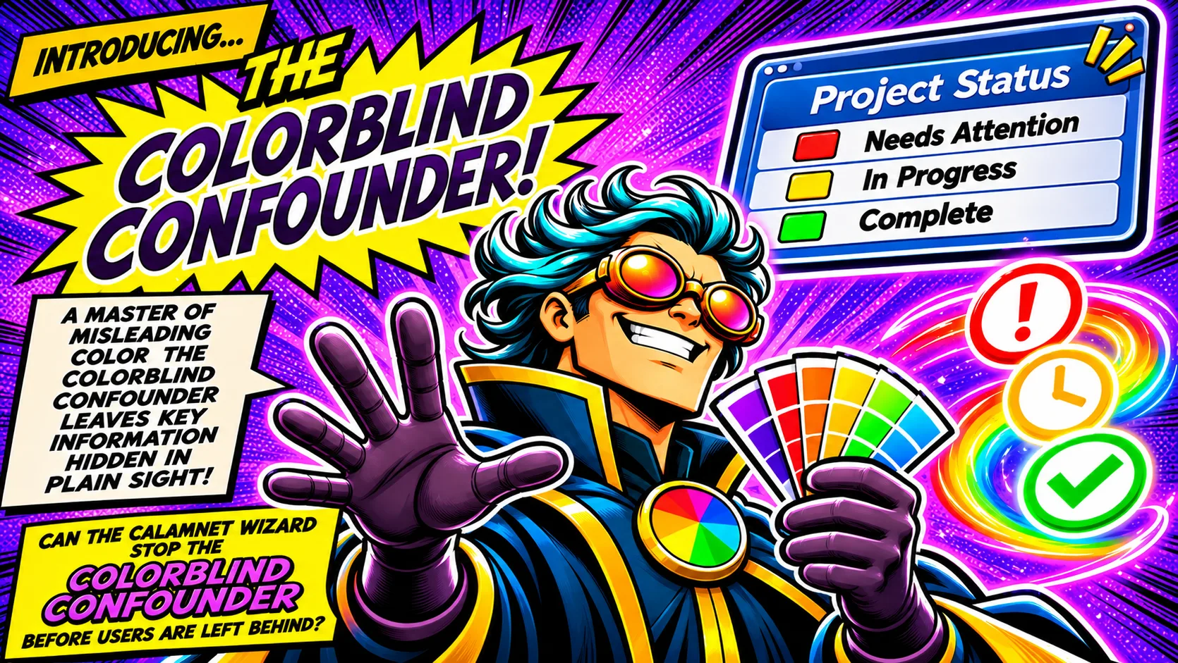
Introducing… The Colorblind Confounder!
A master of misleading color, the Colorblind Confounder leaves key information hidden in plain sight!
The Project Status board shows a red square for “Needs Attention,” a yellow square for “In Progress,” and a green square for “Complete.” Nearby, an exclamation mark, clock, and check mark show how distinct icons can communicate those statuses.
Can the Calamnet Wizard stop the Colorblind Confounder before users are left behind?
Comic Panel!
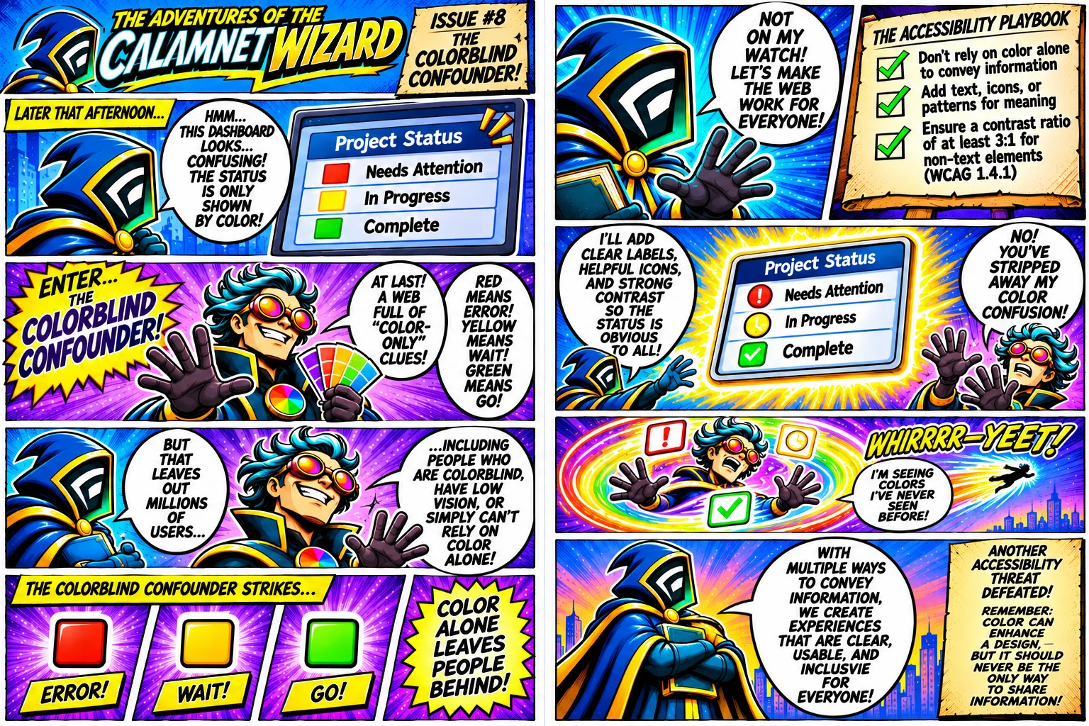
The Adventures of the Calamnet Wizard. Issue 8: The Colorblind Confounder!
Later that afternoon, the Wizard looks at a Project Status dashboard. It shows a red square for “Needs Attention,” yellow for “In Progress,” and green for “Complete.”
Calamnet Wizard: “Hmm… This dashboard looks… confusing! The status is only shown by color!”
Enter… The Colorblind Confounder!
Colorblind Confounder: “At last! A web full of ‘color-only’ clues! Red means error! Yellow means wait! Green means go!”
The dialogue continues: “But that leaves out millions of users… including people who are colorblind, have low vision, or simply can’t rely on color alone!”
The Colorblind Confounder strikes. Red is labeled “Error!” Yellow is labeled “Wait!” Green is labeled “Go!” A burst reads “Color alone leaves people behind!”
Calamnet Wizard: “Not on my watch! Let’s make the web work for everyone!”
The Accessibility Playbook: Don’t rely on color alone to convey information. Add text, icons, or patterns for meaning. Ensure a contrast ratio of at least 3 to 1 for non-text elements. The artwork lists WCAG 1.4.1 with that last line.
Calamnet Wizard: “I’ll add clear labels, helpful icons, and strong contrast so the status is obvious to all!” The revised Project Status board shows an exclamation mark for “Needs Attention,” a clock for “In Progress,” and a check mark for “Complete.”
Colorblind Confounder: “No! You’ve stripped away my color confusion!” A swirl of color and status icons sends him flying. “Whirrrr—yeet! I’m seeing colors I’ve never seen before!”
Calamnet Wizard: “With multiple ways to convey information, we create experiences that are clear, usable, and inclusive for everyone!”
Closing caption: Another accessibility threat defeated! Remember: Color can enhance a design, but it should never be the only way to share information!
Featured Tool!
Generate balanced, accessible color palettes from a base color or image.
Open Palette Generator