


Published: | Category: In-depth
WCAG 1.4.3 Contrast (Minimum) and 1.4.6 Contrast (Enhanced)
WCAG Deep Dive
Color contrast is one of the most recognized accessibility requirements on the web, but WCAG 1.4.3 is more nuanced than simply checking whether text "looks dark enough." This guide explains exactly what the criterion requires, how contrast ratios work, which text qualifies for the lower threshold, what is exempt, and how to test real interfaces without falling into common traps.
What is WCAG 1.4.3?
WCAG Success Criterion 1.4.3 is called Contrast (Minimum). It is a Level AA requirement and applies to the visual presentation of text and images of text.
At its core, the rule requires enough contrast between text and its background for people with moderately low vision or reduced contrast sensitivity to read the content more reliably.
The basic thresholds are:
- 4.5:1 for normal-sized text.
- 3:1 for text that qualifies as large-scale text.
WCAG treats those values as minimum thresholds. A contrast ratio of
4.49:1, for example, does not technically pass a
4.5:1 requirement simply because it is close.
Why contrast matters
Text that is easy for one person to read may be extremely difficult for another. Low vision, aging, glare, poor displays, reduced contrast sensitivity, color vision differences, and environmental conditions can all affect how easily text can be distinguished from its background.
A pale gray paragraph on a white background may appear elegant on a high-end monitor in a dim office, but that same text may become nearly unreadable on a laptop outdoors or for someone whose vision requires stronger luminance differences.
That is why WCAG does not ask whether a color combination merely looks readable. It defines a measurable contrast ratio instead.
What does a contrast ratio actually measure?
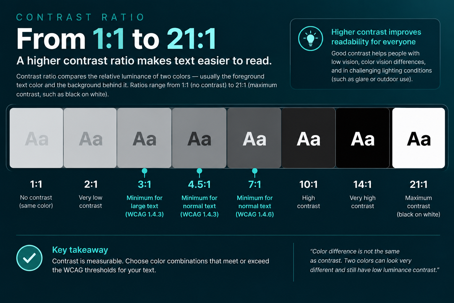
Contrast ratio compares the relative luminance of two colors: usually the foreground text color and the background behind it.
Contrast ratios range from 1:1 to 21:1.
- 1:1 means the foreground and background have effectively the same luminance.
- 21:1 is the maximum possible contrast, such as black against white.
WCAG calculates contrast using relative luminance rather than simply comparing hue, saturation, or the numeric distance between two hex values.
This is important because two colors can look dramatically different in hue while still being close in brightness.
The two contrast thresholds you need to remember
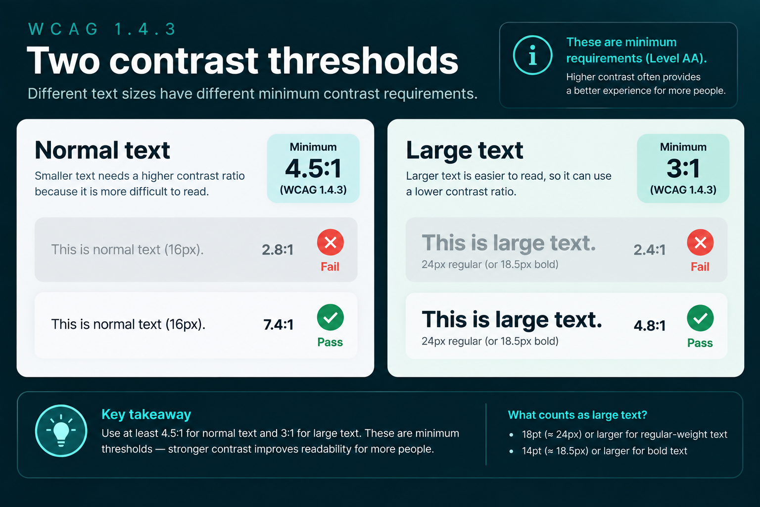
Normal text: 4.5:1
Most text on a website falls into this category.
Paragraph text, navigation labels, form labels, metadata, breadcrumbs, table content, button text, help text, validation messages, and similar content generally need at least:
4.5:1 contrast against the background.
Large text: 3:1
Larger text is allowed a lower minimum contrast ratio because larger character shapes and wider strokes are generally easier to perceive.
Large-scale text needs at least:
3:1 contrast against the background.
The tricky part is determining what WCAG considers large.
What counts as large text?
WCAG defines large-scale text as approximately:
- 18pt or larger for regular-weight text.
- 14pt or larger for bold text.
In CSS pixels, those values are approximately:
- 24px for regular text.
- 18.5px for bold text.
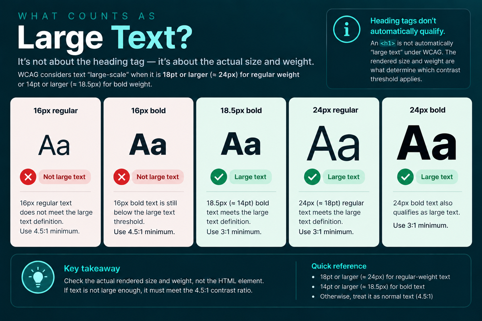
The conversion comes from the CSS relationship of
1pt = 1.333px.
What does "bold" mean?
WCAG uses the general idea of sufficiently heavy text when discussing the
14-point threshold. In real-world testing, you should be cautious about assuming
that every font at font-weight: 600 or 700 behaves
identically.
Fonts with unusually thin strokes or unfamiliar letterforms may remain difficult to read even when they technically qualify by size.
Treat the WCAG threshold as a minimum rather than a design target.
Practical examples
Example 1: body text
.article-copy {

font-size: 16px;
color: #777777;
background: #ffffff;
}
Because this is normal-sized text, it must reach at least 4.5:1.
If your contrast checker reports anything below that threshold, the text fails WCAG 1.4.3.
Example 2: a large heading
.hero-heading {

font-size: 40px;
font-weight: 700;
color: #667788;
background: #ffffff;
}
This clearly qualifies as large-scale text, so the minimum contrast requirement is 3:1.
That does not mean low-contrast headings are automatically a good design choice. It simply means the WCAG AA threshold is lower for sufficiently large text.
Example 3: button text
<button class="save-button">

Save changes
</button>
.save-button {
background: #2d6a73;
color: #ffffff;
}The text inside a button is still text, so its contrast against the button background is evaluated under 1.4.3.
The visibility of the button itself is a separate issue that may fall under WCAG 1.4.11, Non-text Contrast.
Text over images is where contrast gets tricky
Checking a simple foreground color against a solid background is easy. Hero banners, photographs, gradients, video backgrounds, and patterned sections are much harder.
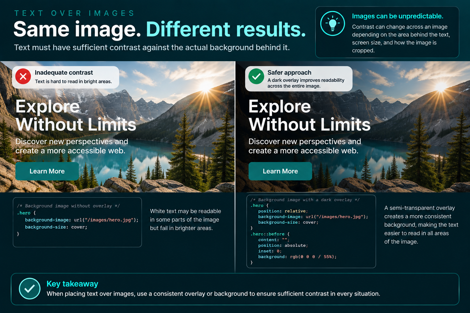
Contrast must be sufficient against the actual background directly behind the text.
Consider this common pattern:
<section class="hero">

<h1>Build something remarkable</h1>
</section>
.hero {
background-image: url("/images/hero.jpg");
background-size: cover;
}
.hero h1 {
color: white;
}White text may contrast strongly with one part of the photograph and poorly with another.
The result can change with:
- viewport width,
- background positioning,
- responsive image cropping,
- different image sources,
- dynamic content,
- or the text wrapping onto another line.
A design that passes at one screen size may fail at another.
A safer pattern
Add a controlled overlay or background behind the text.
.hero {

position: relative;
background-image: url("/images/hero.jpg");
background-size: cover;
}

.hero::before {
content: "";
position: absolute;
inset: 0;
background: rgb(0 0 0 / 55%);
}

.hero-content {
position: relative;
color: #ffffff;
}
The overlay makes the text/background relationship more predictable and easier to test.
Gradients require more than one contrast check
If text sits across a gradient, you cannot necessarily test only one background color.
.banner {

color: #ffffff;
background:
linear-gradient(
90deg,
#142f35,
#4fa99f
);
}
Contrast can vary along the length of the text.
You need to evaluate the portions of the background that actually appear behind the characters.
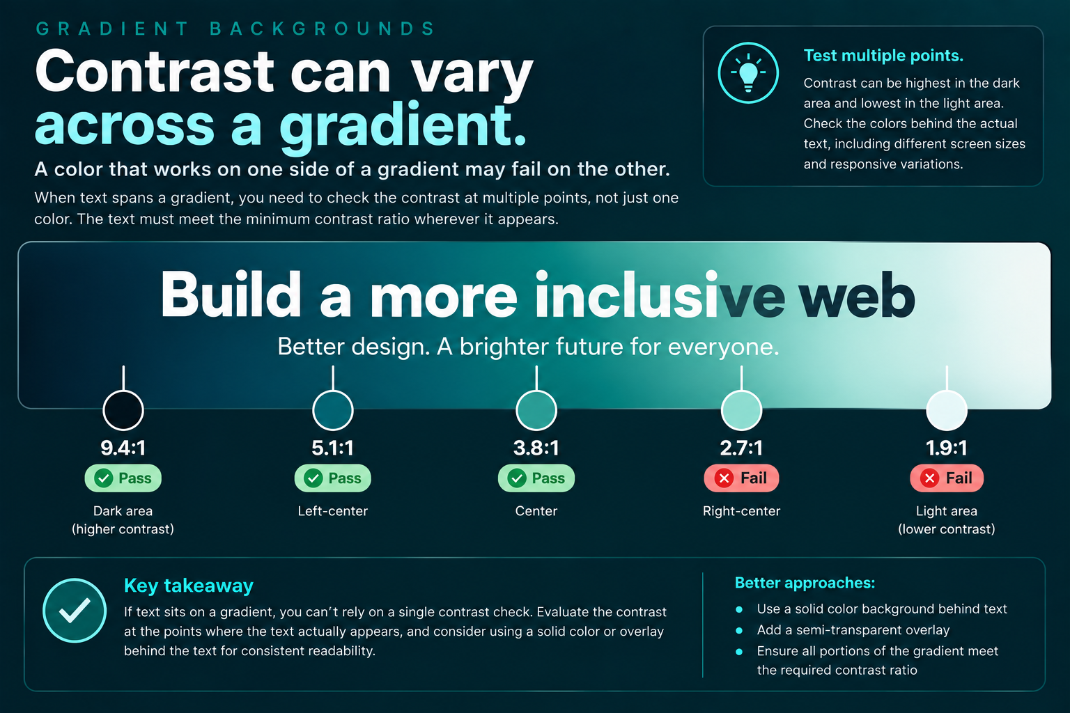
In practice, a stable solid-color layer behind text is often easier to maintain than trying to engineer a gradient that barely meets the threshold at every point.
Yes, placeholder text counts
Placeholder text inside form controls is still visually presented text. WCAG's Understanding documentation specifically notes that placeholder text needs sufficient contrast when it is used.
<input

type="email"
placeholder="[email protected]"
/>
Browsers often render placeholders in a lighter color by default, and custom designs frequently make them even lighter.
input::placeholder {

color: #999999;
}
Test that color against the actual input background just as you would any other text.
Do not forget hover, focus, selected, and active states
Interfaces change.
A link may pass contrast in its default state and fail when hovered. Button text may pass normally but become too faint when disabled or selected. Navigation text may change colors when the current page is active.
Test the text in every meaningful visual state.
a {

color: #145c8e;
}

a:hover {
color: #78a9c7;
}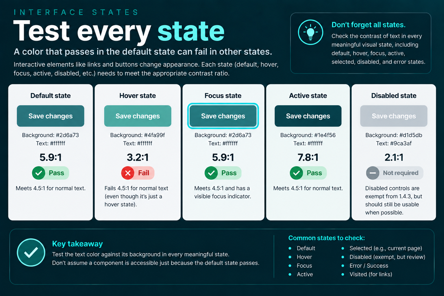
The default color and hover color should each be evaluated against the background on which they appear.
What text is exempt from 1.4.3?
WCAG includes several important exceptions.
Inactive interface components
Text that is part of an inactive user interface component does not have a contrast requirement under this criterion.
A disabled control is a common example.
<button disabled>

Submit application
</button>
Be careful with this exception. Making controls unnecessarily difficult to see can still create a poor user experience, even where the criterion does not require the normal threshold.
Purely decorative text
Text that conveys no information and serves only a decorative purpose is exempt.
The key phrase is purely decorative. If a person is expected to read the words or obtain information from them, the exemption does not apply.
Text that is not visible to anyone
Text that is not visually presented does not need to satisfy a visual contrast requirement.
Incidental text inside a larger picture
Text that happens to appear within a photograph or image containing significant other visual content may qualify as incidental.
For example, the name printed on someone's shirt in a photograph is very different from intentionally creating a promotional graphic where the important message itself is rendered as text inside the image.
Logos and brand names
Text that is part of a logo or brand name is exempt from the contrast requirement.
That does not necessarily make poor logo contrast a good idea. In particular, consider stronger-contrast logo variants when the logo also functions as an interactive link or control.
Images of text still count
WCAG 1.4.3 applies not only to HTML text but also to images of text.
If you create a graphic containing:
- an event announcement,
- a sale price,
- a quote,
- a headline,
- instructions,
- or any other meaningful text,
the text inside that graphic may still need to meet the same contrast threshold.
This is one reason ordinary HTML text is usually preferable. HTML gives users and browsers far more flexibility for zooming, resizing, adapting colors, and rendering content.
Do not measure the fuzzy edge pixels of rendered letters
Modern browsers smooth text using anti-aliasing. As a result, the pixels around the edges of a character may appear lighter or darker than the CSS color you specified.
WCAG contrast evaluation generally uses the specified foreground and background colors rather than attempting to measure every anti-aliased pixel visible in a screenshot.
This is another reason a color contrast analyzer that understands CSS colors is usually more reliable than visually sampling a random edge pixel from a letter.
You do not need black text on a white background
WCAG does not require a particular color palette.
You can use:
- dark blue on light gray,
- cream on dark green,
- yellow on dark navy,
- white on burgundy,
- or countless other combinations.
What matters is whether the calculated contrast ratio reaches the appropriate threshold.
Good accessibility does not require abandoning brand colors. It often means defining accessible variants of those colors for different backgrounds and purposes.
The best place to solve contrast problems is your design system
Checking contrast page by page works, but it is inefficient.
A stronger approach is to define approved foreground/background combinations in your design system.
:root {

--color-text: #182225;
--color-text-muted: #536368;
--color-surface: #ffffff;
--color-surface-dark: #102c31;
--color-text-on-dark: #ffffff;
--color-link: #176b75;
}
Then test those combinations before they spread across dozens of components.
You can document tokens as:
- approved for normal text,
- approved only for large text,
- decorative only,
- or not approved for text.
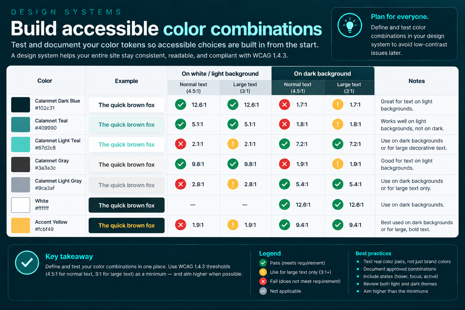
This turns contrast testing from a cleanup exercise into a design constraint.
Common ways websites fail 1.4.3
1. Muted gray text becomes too muted
Secondary text is often intentionally lighter than primary text. That is fine until the color drops below the required threshold.
Timestamps, card metadata, captions, breadcrumbs, helper text, copyright notices, and footer content are common offenders.
2. Text overlays a photograph
The designer checks one portion of the image, but responsive cropping later moves the text over a brighter region.
3. Placeholder text is nearly invisible
Placeholder text is often styled with an extremely pale gray even though it is expected to be read.
4. Brand colors are used everywhere
A brand color that works beautifully as a large decorative block may not work as 14-pixel body text on white.
5. Developers test the wrong background
Semi-transparent layers, gradients, overlays, cards, and nested elements can make the visible background different from the CSS value developers initially expect.
6. The combination barely passes
Designing directly against the numerical threshold leaves very little room for future color changes.
A value of 4.51:1 may technically pass, but a small design-system
adjustment can turn it into a failure.
How to test WCAG 1.4.3
Contrast testing is one of the accessibility checks that automation can perform reasonably well, but it still benefits from human review.
Step 1: Identify the foreground color
Determine the actual color of the text in the state you are testing.
Step 2: Identify the background directly behind it
This may be:
- a solid background color,
- a parent element,
- a gradient,
- an image,
- a translucent overlay,
- or a combination of several layers.
Step 3: Determine whether the text qualifies as large
Do not assume. Check the rendered font size and weight.
Step 4: Calculate the ratio
Use a trusted contrast analyzer, browser accessibility tool, design-tool plugin, or automated testing tool.
Step 5: Test important states
Include:
- default,
- hover,
- focus,
- active,
- selected,
- error,
- success,
- visited where applicable,
- and responsive variations.
Step 6: Review dynamic backgrounds manually
Automated tools may struggle with images, video, gradients, overlays, and dynamically changing content.
Those situations deserve manual inspection.
What automated accessibility scanners can and cannot tell you
Automated tools can identify many straightforward contrast failures where the foreground and background colors are known.
They may have difficulty when:
- text appears over an image,
- backgrounds use transparency,
- gradients cross behind characters,
- content changes after interaction,
- custom rendering is used,
- or the tool cannot determine which background is visually relevant.
Passing an automated scan therefore does not prove that every text element meets 1.4.3.
Automated testing is excellent for finding problems. It should not be mistaken for complete accessibility verification.
A special note about links
Link contrast creates two different questions:
- Can the link text be read against its background?
- Can users tell that the text is a link?
WCAG 1.4.3 primarily addresses the first question.
For example, a blue inline link must still meet the appropriate contrast ratio against the page background.
Separately, if color alone distinguishes an inline link from surrounding text, additional requirements associated with WCAG 1.4.1 may come into play.
Underlining links remains one of the clearest ways to avoid making users depend entirely on color differences.
Minimum contrast should be a floor, not a target
WCAG conformance thresholds answer a specific question:
Does this content satisfy the minimum requirement?
They do not necessarily answer:
Is this the most readable design we could reasonably provide?
If your body text reaches exactly 4.5:1, it may technically pass.
Increasing that contrast may still make the page easier to use for more people.
At the same time, maximum contrast is not universally preferred in every visual situation. Accessibility is not synonymous with forcing every page to use pure black and pure white.
The goal is a robust, readable palette with adequate contrast and thoughtful typography.
A practical 1.4.3 checklist
- Normal text reaches at least 4.5:1.
- Large-scale text reaches at least 3:1.
- Large-text classification is based on actual rendered size and weight.
- Placeholder text has been checked.
- Button, navigation, and form-control text has been checked.
- Hover, focus, selected, and other relevant states have been checked.
- Text over images has been tested against every relevant part of the background.
- Gradients and transparency have been reviewed.
- Images containing meaningful text have been tested.
- Decorative and incidental exemptions have not been applied too broadly.
- Important color combinations are documented in the design system.
- Automated results have been supplemented with manual review where needed.
Related Calamnet tools:
- Palette Generator
The Palette Generator helps you create accessible color palettes that meet WCAG 2.1 success criteria for contrast and readability.
- CIE Laboratory
The CIE Laboratory provides tools for color analysis and evaluation, ensuring your designs meet accessibility standards.
Final takeaway
WCAG 1.4.3 is one of the easiest accessibility criteria to summarize and one of the easiest to underestimate.
The headline numbers are simple: 4.5:1 for normal text and 3:1 for large text.
Real-world implementation becomes more complicated when text appears over photographs, gradients, translucent layers, buttons, form controls, responsive layouts, and changing interface states.
The best approach is not to wait for an accessibility audit to discover dozens of low-contrast combinations. Build contrast into your color tokens, components, and design system from the beginning.
When accessible color combinations become part of the system rather than an after-the-fact correction, WCAG 1.4.3 becomes much easier to maintain.