

The Adventures of the Calamnet Wizard – Panel 2

Intro!
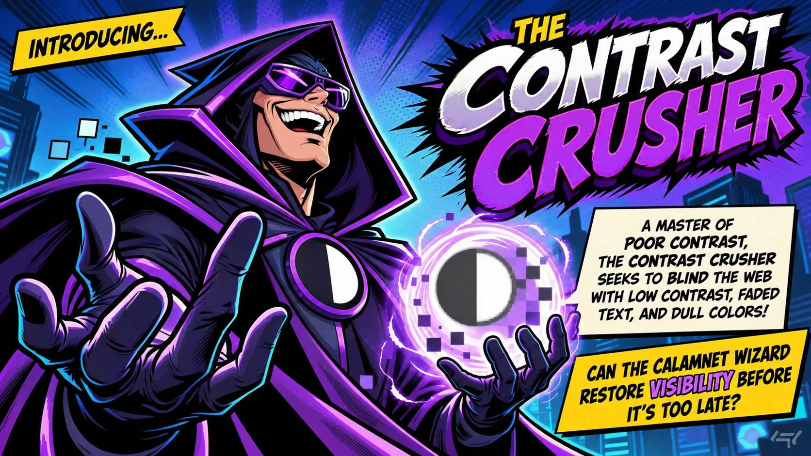
Introducing… The Contrast Crusher!
A master of poor contrast, the Contrast Crusher seeks to blind the web with low contrast, faded text, and dull colors!
Can the Calamnet Wizard restore visibility before it’s too late?
Comic Panel!
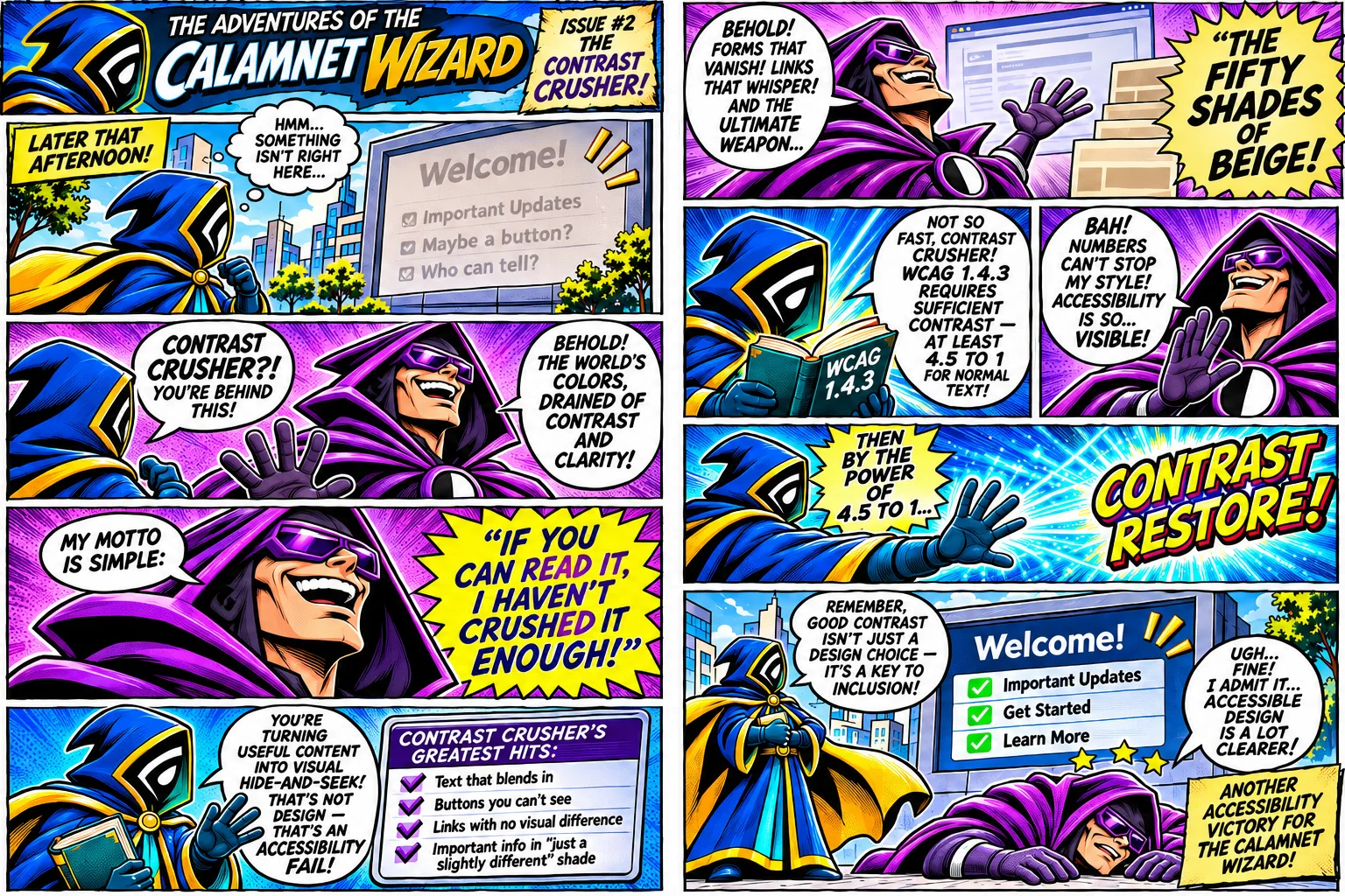
The Adventures of the Calamnet Wizard. Issue 2: The Contrast Crusher!
Later that afternoon, the Wizard studies a faded display. “Hmm… Something isn’t right here…” The display reads “Welcome!” followed by “Important Updates,” “Maybe a button?” and “Who can tell?”
Calamnet Wizard: “Contrast Crusher?! You’re behind this!”
Contrast Crusher: “Behold! The world’s colors, drained of contrast and clarity! My motto is simple: If you can read it, I haven’t crushed it enough!”
Calamnet Wizard: “You’re turning useful content into visual hide-and-seek! That’s not design. That’s an accessibility fail!”
Contrast Crusher’s Greatest Hits: Text that blends in. Buttons you can’t see. Links with no visual difference. Important info in a “just slightly different” shade.
Contrast Crusher: “Behold! Forms that vanish! Links that whisper! And the ultimate weapon… the fifty shades of beige!”
Calamnet Wizard, holding a book marked “WCAG 1.4.3”: “Not so fast, Contrast Crusher! WCAG 1.4.3 requires sufficient contrast, at least 4.5 to 1 for normal text!”
Contrast Crusher: “Bah! Numbers can’t stop my style! Accessibility is so… visible!”
Calamnet Wizard: “Then by the power of 4.5 to 1… Contrast restore!”
The display becomes clear. It reads “Welcome!” with check marks beside “Important Updates,” “Get Started,” and “Learn More.”
Calamnet Wizard: “Remember, good contrast isn’t just a design choice. It’s a key to inclusion!”
Contrast Crusher, lying dazed: “Ugh… Fine! I admit it… Accessible design is a lot clearer!”
Closing caption: Another accessibility victory for the Calamnet Wizard!
Featured Tool!
Advanced color science workspace for contrast, perceptual models, and accessibility analysis.
Open CIE Laboratory